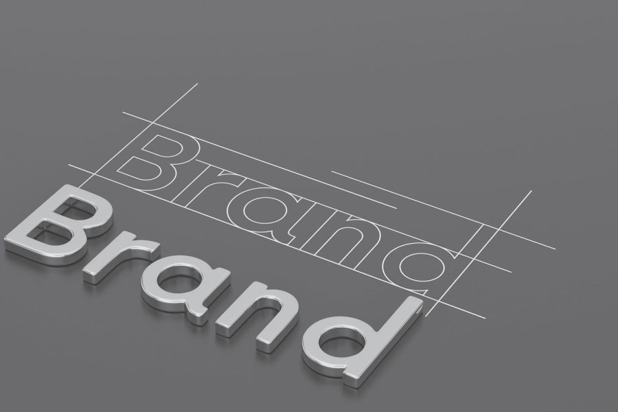
Ever landed on a website and immediately felt like you could trust the brand — or maybe, the opposite? That instant feeling isn’t random. It’s brand design psychology at work.
As a small business owner, your design choices aren’t just about looking good. They’re about building trust, evoking emotion, and nudging people to take action. At Seer Designs, we help brands create that exact effect — through intentional design that speaks to the subconscious mind.
Let’s break it down.
Why Design Psychology Matters
Humans process visuals 60,000 times faster than text. That means people form opinions about your brand before they even read a single word.
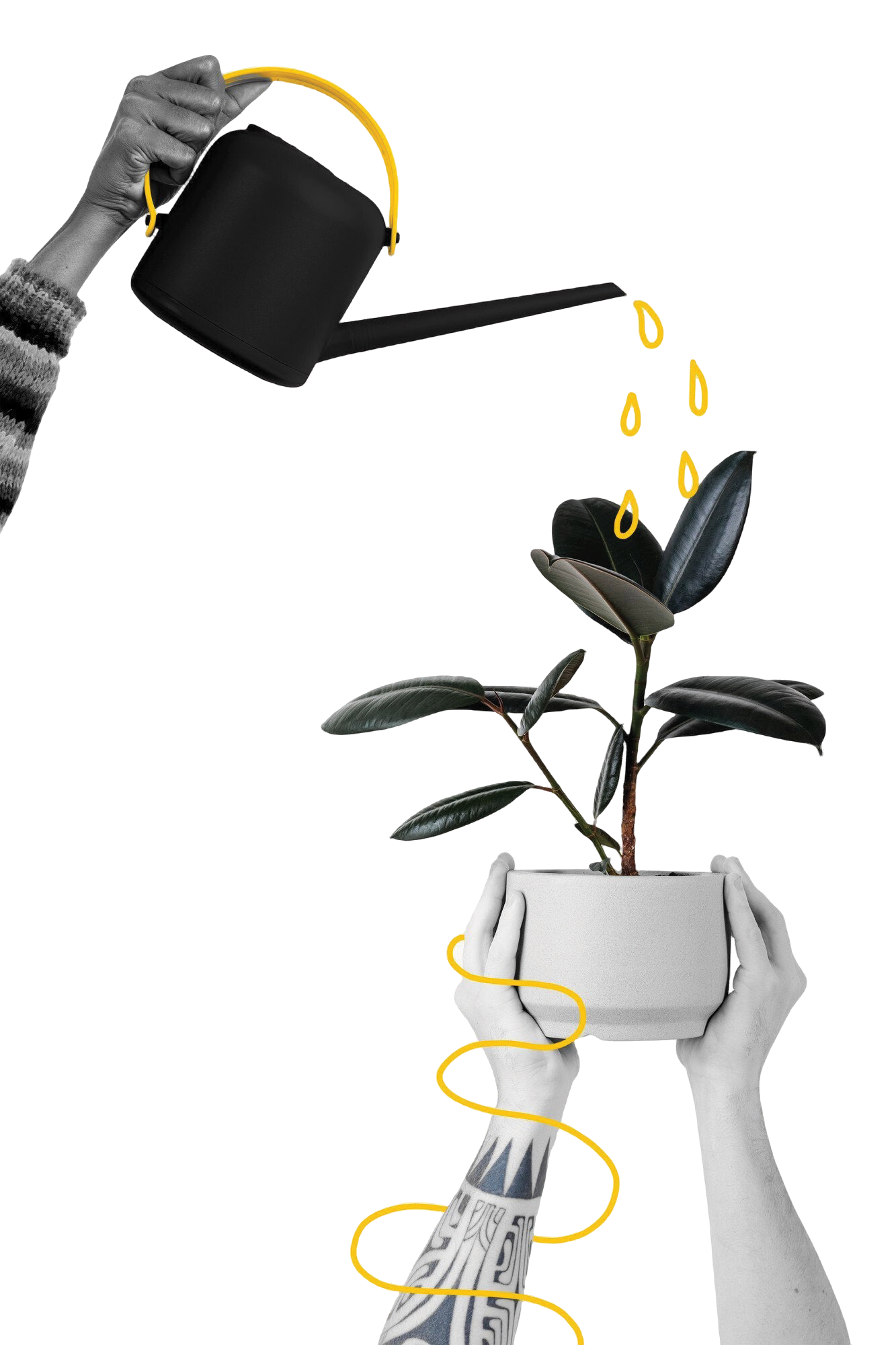
Design isn’t just decoration — it’s strategy. Every element you choose tells a story. If your website or branding doesn’t feel aligned, potential customers feel it too — and they bounce.
The Power of Color
Color triggers emotion. It can attract the right people, or drive them away.
- Blue = Trust, calm, professionalism (used by banks, tech, healthcare)
- Red = Urgency, energy, action (used in sales, food, retail)
- Green = Growth, health, balance (great for wellness or eco brands)
- Black = Luxury, sophistication (popular with high-end brands)
- Yellow = Optimism, youth, creativity (perfect for fun and bold brands)
At Seer Designs, we help you choose a palette that matches your mission and influences how your audience feels about you.
Fonts Speak Louder Than You Think
Your font style quietly says a lot:
- Serif fonts (like Times New Roman): Traditional, trustworthy
- Sans-serif fonts (like Helvetica): Clean, modern, approachable
- Script or handwritten fonts: Personal, creative, boutique vibes
- Bold or uppercase fonts: Confident, strong, direct
We don’t just pick fonts because they “look nice” — we choose them to align with your audience and message.
Layouts That Guide (and Convert)
A good layout leads the eye exactly where you want it to go. A bad one? It confuses, overwhelms, and kills conversions.
Here’s what matters:
- Hierarchy: Headlines should grab attention, followed by easy-to-read content.
- Whitespace: Give your design room to breathe. Clutter = chaos.
- Navigation: Simple menus and clear calls-to-action lead to better user experience (and more sales).
Think of your layout as a tour guide — showing users where to go and what to do next.
Ready to Make Design Work For You?
If your brand or website isn’t getting the traction it should, it might be the design doing the talking — just not in the way you want.
Let’s build a brand that connects, converts, and truly reflects who you are.